Company information for Raphael Tuck & Sons, Ltd. It reads 'London, Paris, and New York. Publishers to the Queen. Designed at the Studios in England. Printed at the Fine Art Works in Germany'.

Raphael Tuck & Sons Ltd


Unlike today, the earliest references to Christmas in the Gazette of 1923 didn’t appear until well in to November. One of the first to appear was a description of the annual ‘package of Christmas and New Year cards, stationery, post cards, calendars and books from the collection of Messrs Raphael Tuck and Sons Ltd’. The firm also designed the cards for the Royal family and in 1923, the King’s card had a particular West Country significance. It depicted ‘William, Prince of Orange, landing at Torbay, 1688, painted by Howard Davie’.
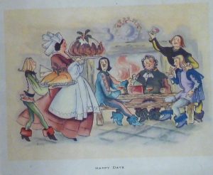
An illustration of four men seated at a table in front of a roaring fire with a flagon of wine. Each man is holding a glass and they are turned to face a woman approaching the table carrying a very large Christmas pudding on a platter. She is followed by another person carrying a plate with a Christmas turkey, adorned with a sprig of holly.

Happy Days

In 1866, Raphael Tuck opened a small shop in London selling prints and picture frames. With the help of his sons and grandsons, they would become one of the most important printing and publishing firms. In 1871 they produced their first Christmas card. The family, originally from Prussia, had some innovative marketing strategies and a highly successful competition for the design of a Christmas card helped launch the ‘industry’ we know today.. They were at the forefront of postcard production during the boom years of the early 20th century, again employing competitions to boost sales and raise money for charitable institutions. During the London blitz of 1940, their now impressive headquarters, were completely destroyed with the loss of 74 years of archive and over 40,000 original paintings, drawings and photographs. However, the firm continued, in family hands, until 1955 when it merged with two other companies.

Two pages of a book which appears to be for learning the alphabet. The letters featured on the pages visible are C, D, E and F. These letters are in large bold font in front of a relevant verse for each letter. The verses are accompanied by illustrations which match the verse. The left hand page reads 'C is for Clarissa for whom Carrie's making A most charming Chain, the greatest care taking. D is for Dear Dolly who sits still and gazes, And D for Delight and D for the Daisies.' The accompanying illustration is of a little girl wearing a pinafore dress and bonnet making a daisy chain, while a doll sits still at her feet. The right hand page reads 'E stands for the Engine that's had a great smash, F stands for the Fender and Freddy so rash.' The illustration accompanying this verse is of a little boy walking away from a toy steam engine that lying on it's the floor in front of a coal fire with its 'passengers' (dolls and toy soldiers) strewn across the floor.

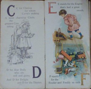
The page of an alphabet book

The three items from our archive collection illustrate a card, a book and a calendar as described in the 1923 Gazette. All of these date from earlier years but show the wide range of items produced by the company. The calendar is particularly delicate as the cups are hinged to the teapot so that the months can be changed.

A card featuring an illustration of a young woman with blonde curly hair wearing a long white dress which she is lifting slightly to reveal her white, heeled shoes. The text reads 'Dollyland ABC', 'Father Tuck's ever welcome series' and 'untearable linen'.

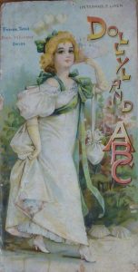
A card for ‘Dollyland’

A calendar in the shape of a teapot with two teacups. Both teapot and cups are pink with white and gold trim. The teapot features the wording 'The At Home Calendar for 1895'. One of the teacups says 'July, the other 'August' and both feature the dates of those months respectively.

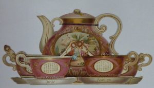
The ‘At Home’ Calendar for 1895

Written by Museum Volunteer, Sue B